
Sherwin Williams
Oceanside is a rich bluish-green toned hue that can be great for any accent wall, home office or even your front door.


Some are calling it the new twist on Navy...
...bringing a sense of comfort but also a color that is bold and adventurous.
"People today have a growing sense of adventure, and it is making its way into even the coziest corners of our homes. We are craving things that remind us of bright folklore, like mermaids and expeditions across continents," explained Sue Wadden, director of color marketing at Sherwin-Williams. Wadden also referred to Oceanside as the color of Wanderlust.
Behr
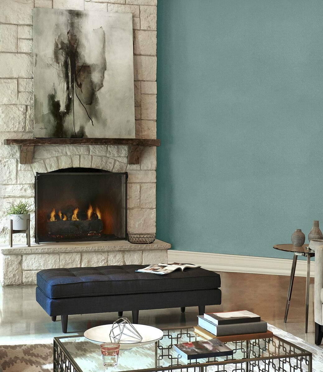

Behr has selected their 2018 Color of the Year to be In the Moment. Being plugged in 24/7, this color is a reminder to turn off the electronics and take some time for YOU! The relaxing blue-green hue creates a sanctuary in the home encouraging the opportunity to unplug. In the Moment has a trace of spruce blue, soft gray and lush green evoking feelings of relaxation and mindfulness.
"Every year we look at what's happening in the world of home décor, fashion, travel, and lifestyle, and we feel like right now, this idea of mindful living and awareness just applies to so many areas of life, from health and well being to create a sanctuary in the home," Erika Woelfel, Vice President of Color and Creative Services at Behr explains. "It's a really big driving influence right now, and we think it’s a great message to tell. In the midst of all the stress we have in our lives, we often can't wait to get home. Our home is our sanctuary, so the colors should all inspire us to relax and disconnect."
Benjamin Moore
After about a year’s worth of searching the globe for inspiration, Benjamin Moore chose Caliente AF-290 as their 2018 Color of the Year. The color and design team journeyed nearly 100,000 miles to 30 cities and 12 countries.

In all of the industry shows they attended and photos they took from their travels around the world they kept ‘seeing red’.
Knowing they needed to decide on a hue comfortable for the home, lead them to Caliente
Caliente is strong and full of energy, but with an almost brown undertone, it becomes soothing, intimate and warm. The perfect color for an accent wall!
"Strong, radiant and full of energy, Caliente AF-290 is total confidence. It is pleasing, passionate and makes people feel special, like 'red carpet treatment,'" said Ellen O'Neill, Benjamin Moore Director of Strategic Design Intelligence. "Whether used as one note or on four walls, the spirited personality of red turns heads signaling surprise and adventure. The eye can't help but follow its bold strokes."

Pantone


Pantone has selected PANTONE 18-3838 Ultra Violet as their 2018 Color of the Year.
With its complexity, Ultra Violet can send your mind on a voyage through the cosmos, the limitless sea of stars and a bring a desire to see what is just beyond the Milky Way’s. With a mystical and spiritual quality attached to this color, Ultra Violet is associated with mindfulness practices, used as lighting in meditational spaces and inspires connection with higher powers.
"We are living in a time that requires inventiveness and imagination. It is this kind of creative inspiration that is indigenous to PANTONE 18-3838 Ultra Violet, a blue-based purple that takes our awareness and potential to a higher level. From exploring new technologies and the greater galaxy to artistic expression and spiritual reflection, intuitive Ultra Violet lights the way to what is yet to come.” –Leatrice Eiseman, Executive Director of The Pantone Color Institute.
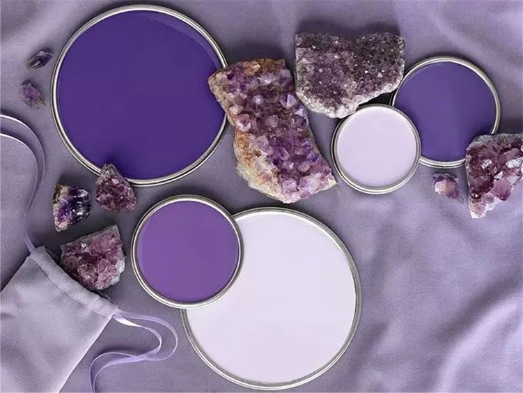
They Suggest it communicates originality, ingenuity, and visionary thinking that points us to the future.